InsureMyTesla
The first Tesla-specific vehicle insurance portal.
InsureMyTesla is a portal where Tesla owners can buy insurance that is custom built for their unique vehicle insurance needs. When I was approached to work on this project, I was told that the goal was to create an experience that felt as exclusive and sleek as driving a Tesla, the only problem is that we're still talking about car insurance...
So, how do you make insurance sexy??
User Advocacy is Queen: I know that all UX designers say this, and it's always true, but in this case, it was REALLY true. We're talking about insurance. Its boring and there are way too many questions and most people just see it as a necessary evil. And given that there are only so many corners you can cut when it comes to keeping people safe and legal (note: This is a joke. There are no corners that can be cut!!), my primary focus was pushing my colleagues in the business department to consider every single question in the flow to ensure the very most efficient user experience.
User Interface for the Win: One advantage of designing for a sexy car company like Tesla is that their UI is already amazing. This meant I didn't have to spend too much time convincing anyone that we needed to devote a solid amount of time to make sure our portal matched Tesla owner's expectations of a seamless, Tesla-branded experience. My product owners and I worked directly with Tesla design and business stakeholders, as well as local insurance experts in the Netherlands and Germany, to ensure that the product was both beautiful and legal. However, there were some unanticipated challenges came in the form of translating my English-language designs into German and Dutch. For example, I had to redesign my sketch symbols to create a responsive dropdown that doesn't lose alignment in a 2-column layout that accommodates phrases like "Zulassung auf den Halter (Versicherungsnehmer)" on a small mobile screen. It was a formidable but satisfying challenge.
This project took about a year to complete, from ideation to production of the first live site and is still evolving as we speak (current as of February 2019). Over the course of the year, the portal team flexed between one (myself) and two designers to absorb changing requirements. My role was primarily Lead Designer and UX Researcher with a few breaks to put out fires in other concurrent projects, but we would not have gotten to where we are now without my amazing co-designer, Venu.
While this version was intended for Tesla, we designed this portal-style product to be responsive and modular (can be quickly adapted for new markets and even brands). Further, we paid special attention to reusable components, scalable layouts, and, of course, a solid user experience no matter the brand.
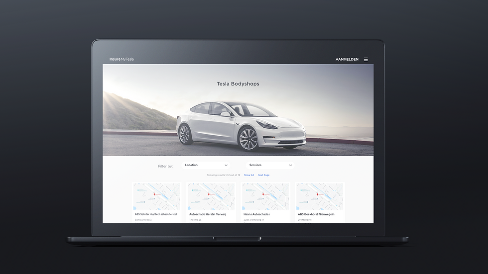
InsureMyTesla is currently live for desktop and mobile in two Germany and the Netherlands, (and is designed to accommodate local market language requirements).
Scroll down to see my process and screenshots of the final product.
*This was a project I worked on as a full-time employee.
Process

1. Market Research
Information gathering and planning.
After meeting with stakeholders to assess business requirements and goals for the product, I started with a competitive analysis of the current auto insurance market. I also collected information from potential users to build personas and user flows to make sure the team wouldn't lose track of our end clients.

2. Ideation
Organizing and strategizing.
At this point I had initial stakeholder input, my user personas, and legal requirements from a few key local markets. I started the design phase by taking stock of the existing InsureMyTesla sites and compared to other more modern, successful insurance portals. I then mapped out features and flow that satisfied those requirements on the whiteboard to share with my stakeholders.

3. Wireframing
Finding the strategic opportunities.
I began the iterative process of wireframing on the whiteboard and then moved to Sketch to share my initial mockups with stakeholders to get their input. Because the business and legal teams were still collecting information on the legal insurance requirements of our target market I mostly focused on conversion opportunities and overall flow at this point. As the requirements became more clear I was able to refine the flow while pushing back to advocate for a quicker and more efficient user experience. We used a LOT of whiteboard cleaner during this phase.

4. Lo-Fidelity Mockups
Initial renderings for the US Tesla market
At this point, about 65% of the business requirements for the US market were determined, which isn't ideal but we needed clickable prototypes to present to external stakeholders to show approximate flow and functionality. This red, black, and gray, design with sharp square lines was consistent with our client's design at the time, but looking back it already feels so dated!

5. Final Designs
Final designs and translation into local language
In this phase, I encountered three challenges that I hadn't anticipated:
Our client was concurrently updating its entire web design. So while my initial designs were consistent with the client's active site, in mid-2018 it shifted to a much rounder, and more modular design aesthetic that I needed to catch up with, STAT. We also hadn't received official design assets from the client until this point. Once I got the fonts, color palette, and design standards things finally started to take shape and look sharp!
We had anticipated a US launch but the business team pivoted towards Europe, which represented a pretty big change to the questions and quote models I had initially planned for. Luckily, I had created a design system that turned out to be pretty bulletproof so once we had the new requirements it wasn't a totally devastating undertaking. It was great practice for refining and scaling design systems, and I definitely learned a ton about Sketch symbols and the amazing Anima plugin.
Dutch and German words are LONG!! Working directly with the end clients to gather and organize translations of all the questions, I updated my entire mockup to reflect the local languages. This was critical to ensuring that dropdowns and other fields could accommodate the lengthy phrases common in Dutch and German (especially for mobile).

6. Quality Control
Ensuring design handoff translates to quality code
At this point, the design was pretty much locked down and it was time to work with my amazing dev team to ensure that the final built product looked as good in real life as it did in InVision. A basic understanding of CSS and React really came in handy, and we were able to crush the final design-build phase.
If you want to see the final design in real life, please head over to InsureMyTesla Germany however you won't be able to make it all the way through the flow (unless you are in the market for some German car insurance...). For those of you not interested in purchasing new insurance, you can check out a few screenshots below.


